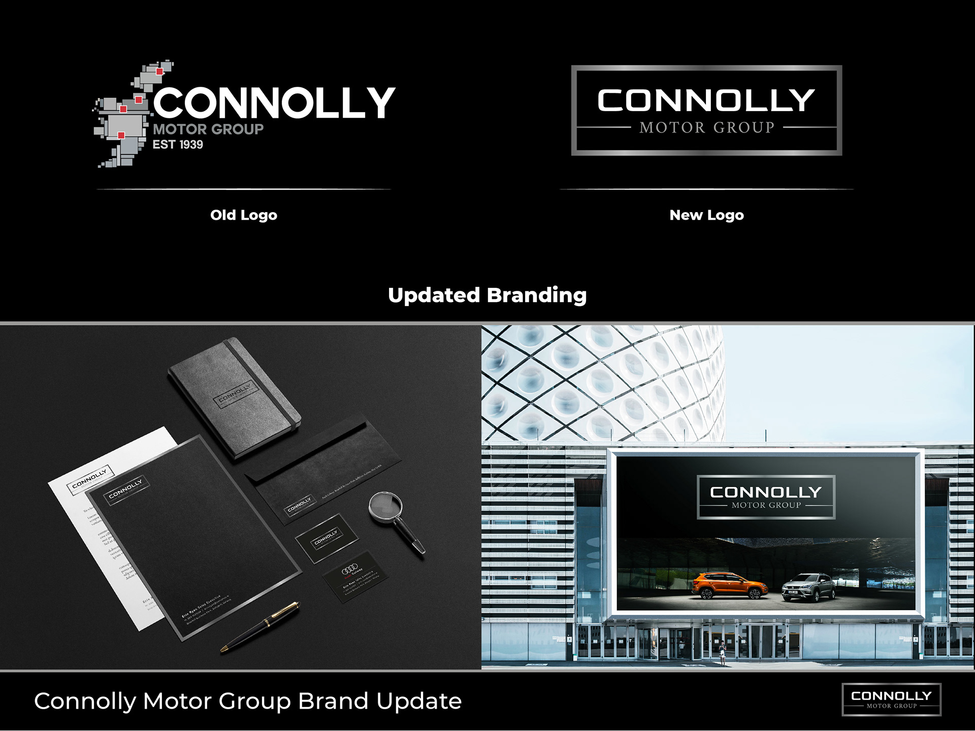
Rebranding for Connolly Motor Group. Working with key stakeholders I developed a fresh, modern look for the brand with a strong, classic design that is a clear face of a motor company.
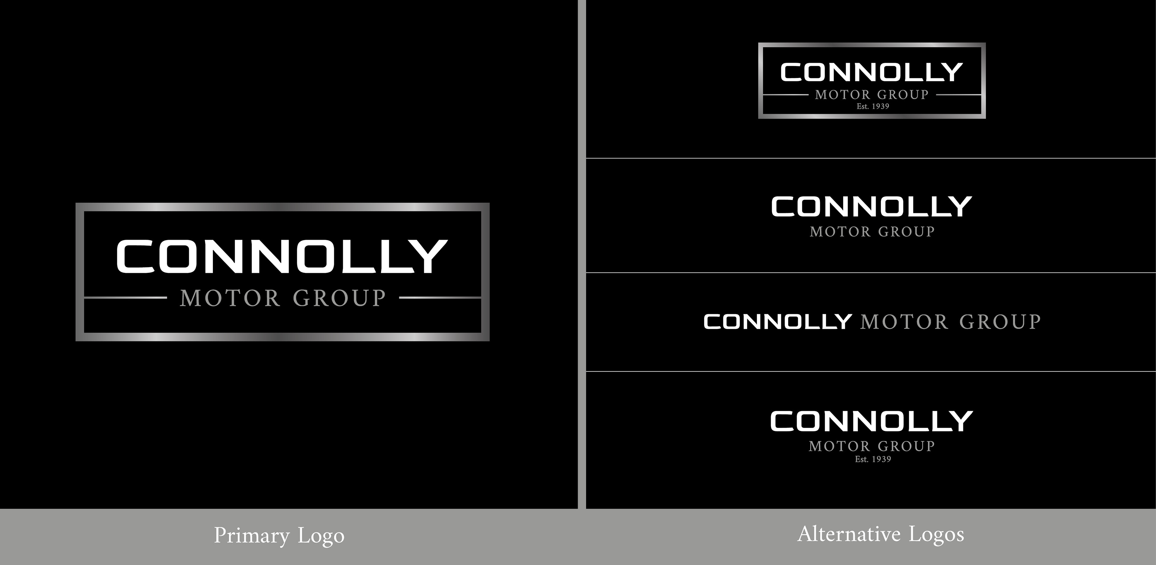
The logo itself combines a futuristic type in bold uppercase letters with a classical serif font for the secondary text. As the 'Connolly's' name is the focal point and most recognisable element for customers I ensured this stood out the most among the rest.
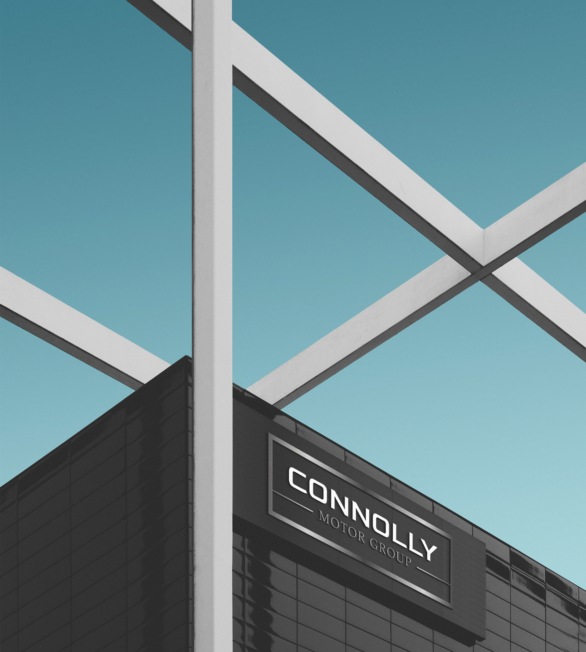
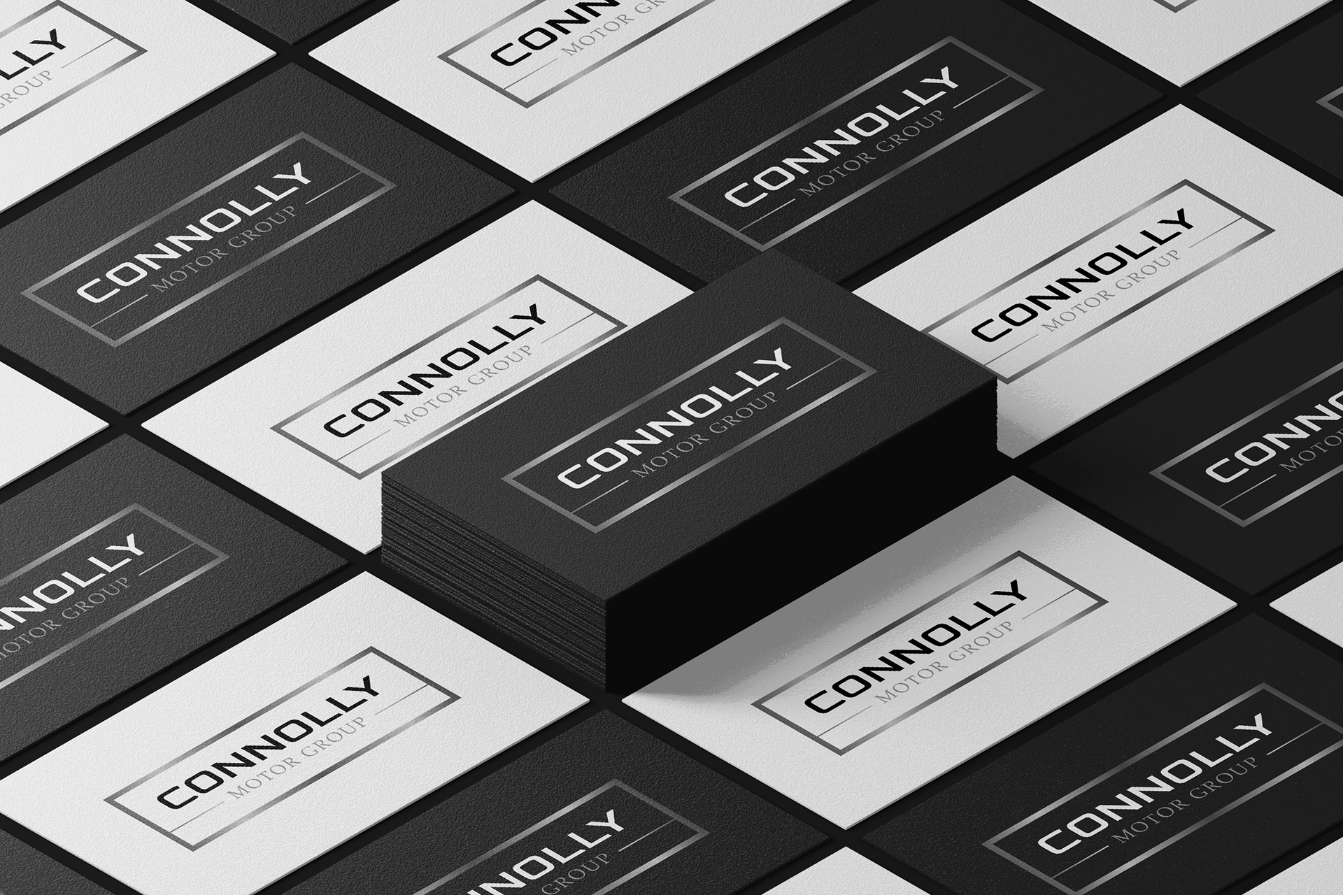
Playing around with subtle outline of the front of a car I developed a container for the text to help solidify the brand name. In order to support the look and of a motor brand I utilised a metallic gradient around the container outline.
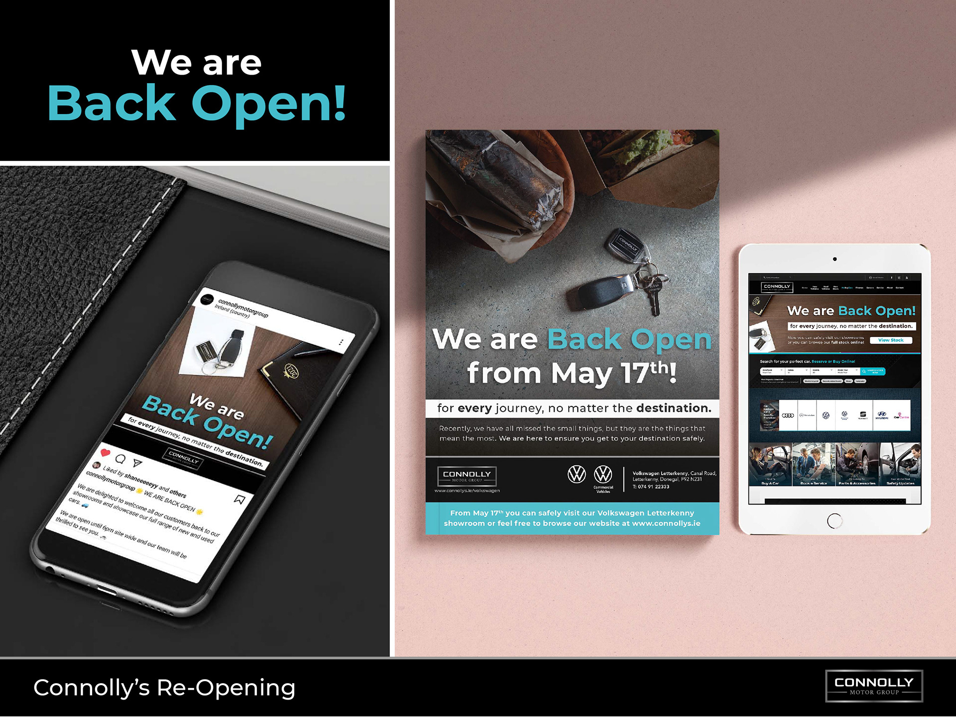
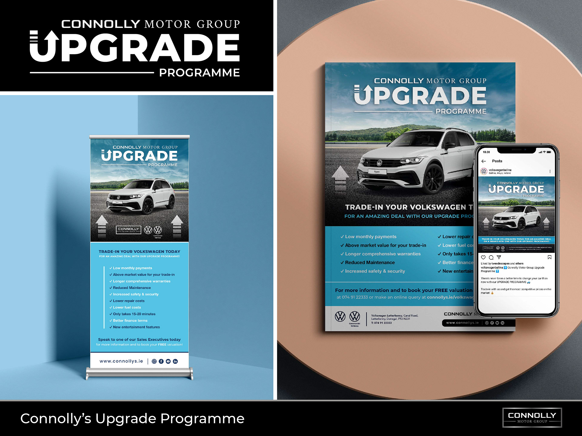
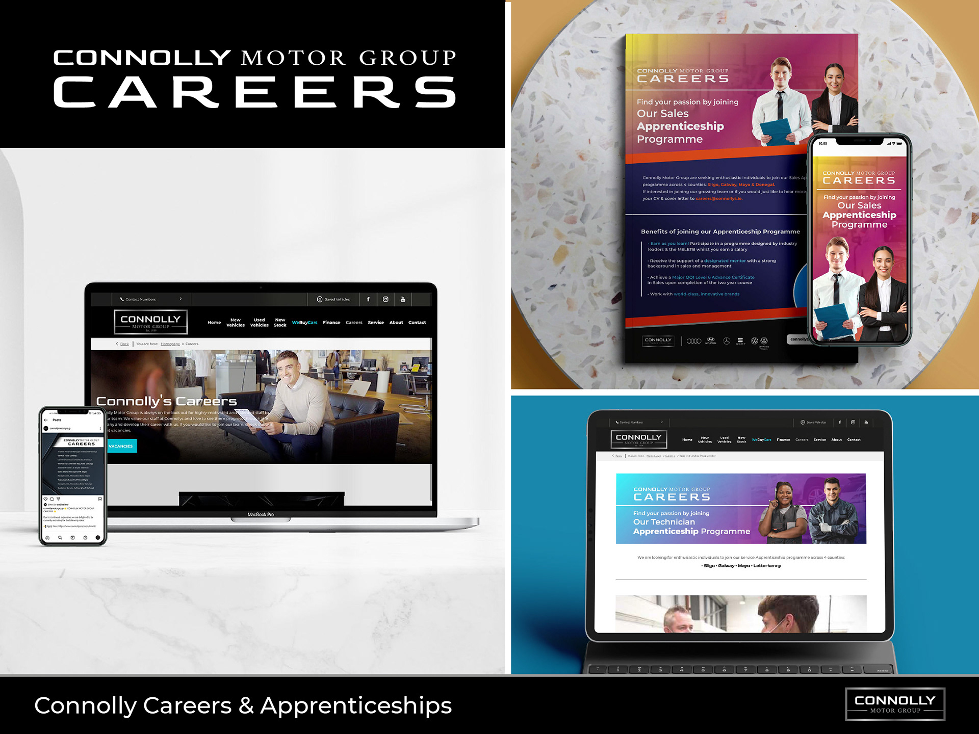
Along with the re-brand I came up with several different campaigns and sub-brands to help push the new Connolly image and brand values. As part of this a re-opening campaign was requested which included website content, a campaign video, press ads, social media and digital advertising. Above are a few samples of the various formats I designed along with the video below.
Connolly motor group re-opening campaign video
After lockdown we were asked to create a campaign to inform customers that we were back open but in a way that resonated with the Irish public. After outlining different Irish activities I came up with a storyboard to showcase what it means for an Irish person to finally begin a normal life again. Having a very small budget and a tight timeline I filmed this on a standard DSLR camera used co-workers and friends to act as actors and provide us with the sets for each scene. I then edited the footage in After effects, using an emotive background instrumental to coincide with the voice of the story.
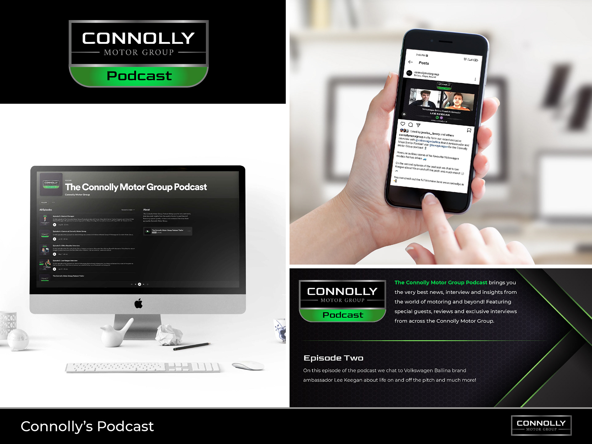
Connolly motor group podcast
As part of an ongoing marketing strategy to attract a younger demographic we started a Connolly Motor Group Spotify podcast where local talents are interviewed. This included brand ambassadors, athletes, motor industry experts, and much more. I created a supporting brand for the Connolly Motor Group podcast that emphasised the brand but also made it clear what exactly the logo is by incorporating the Spotify colours. This has been very successful so far and increased traffic to our website and social pages by over 30%.